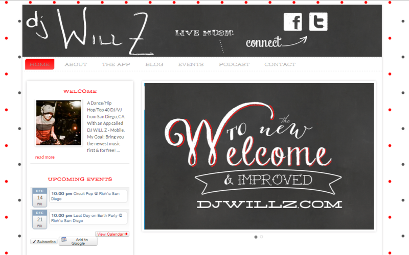
I designed a website for a DJ (DJ Will Z) he was using wix, which is a plug in based website. He wanted to have something to use easily. I introduced him to WordPress and he wanted a site that he could have everything in one place.
For the overal design I went for the chalk lettering look. I used a chalk board back ground in the header and his welcome slide. Normally I would have used my own handwriting but I thought I would look more personal if he used his. So I had him write out his name and turned it into his logo.
I am please just with how this site turned out, because not only is he a client he is a closed friend. We both wanted his brand to have a more professional look so club owners could take him seriously.
Take a look at his site and listen to his podcast or download the app which is going to be reconstructed by yours truly in the next few weeks.
Check out DJ Will Z’s site.
I have to say I was very hesitant on redesigning my website because I always figured if it wasn’t broke way fix it. But I went with it and can I say the outcome of the work that Katrina Martin put into my website developing it. That the outcome was incredible! I was astounded by the finished product. I am excited once again to show new clients and old ones my new revamped website with pride finally. Instead of my website being just an after thought it is now something I can show case along with my app. I have to say thank you very much for helping me take my business to the next level. I would refer her to anyone looking for a new site or even a revamp of something old. Very satisfied as a customer! Thank you!
– William Zakrajshek

Share Your Thoughts
