Developers love working with designers who make creating well-organized files a priority. It makes our job so much easier.
Since I’ve gone full time as a developer only. I’ve noticed that there are still some designers that aren’t familiar with web design. So here are some steps that will keep your developer happy and out of your inbox.
Step One: Organize Your Layers
I’m not sure how I can stress enough on how important it is to have organized layers and groups with layers. Life is easy when we can just turn a group or layer on or off when created it in a live usable version.
If I just want to focus on the navigation, I can’t do that if I’m searching for your layers for it. It should be placed in a group with layers.
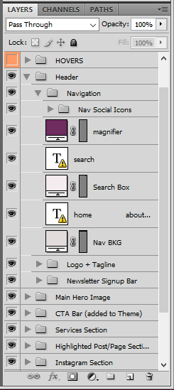
*Yes you CAN use groups and layers in Adobe Illustrator.
I found this really cool site called Photoshop Etiquette that will help you out.
Step Two: Use Full Pixels
I’ve run across this a few times. The internet runs on pixels (72 dpi or dots per inch), your tv and computer displays in pixels. A half pixel isn’t a thing and you shouldn’t make it a thing either. The interweb counts pixels to determine size, shape, width, and height. Using a half pixel or something insane like 78.86px will force the developer to adjust your entire mockup.
Also, note that not using full pixels in print can cause issues as well.
Step Three: Use Fonts with a Web License
I guess we start at the begining and answer the question. What are web fonts? It works the same way as the one you would install on your computer. However, this will be installed for your browser use. So that anything time someone is on that site it will show that fonts that are installed regardless if the visitor has them installed on their computer or not.
When you select the fonts you’ll be using on someone’s website (header and body fonts). Please make sure there is a web font available because desktop fonts and web fonts are not one in the same. I’ve seen this happen a few times where I’m sent font files and the web fonts are missing.
Here’s a good read on Web Font Licensing.
Step Four: Use A Grid
So in design school, you’ll learn about using a grid system when designing websites. Now I know not every designer went to college to become a web designer but it is important to understand design fully.
Now there are several types of grid systems you can use. Pick one. Anyone. Everything has a place and that place is a grid.
You can read more about Grid Systems.
Step Five: Be Consistent
Ideally, you should be creating a style guide for the website you’re building. This would include the various THML text options and color schemes. For an example:
- Headers (1 – 6)
- Body Text
- Bold (Strong) Text
- Italic Text
- Buttons
- List
- Blockquotes
- Links
- Hover effect (Links & Buttons)
- Form Fileds
Knowing and most importantly seeing these visual will make it easier for your developer to code those into the custom theme.
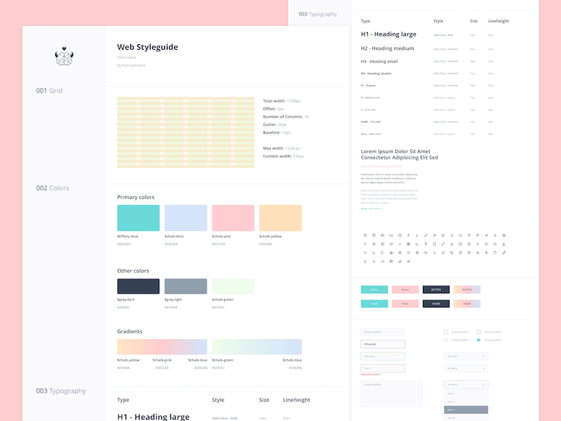
Check out this great post about Web Design Elements by Spruce Rd.
Step Six: Provide Screenshot
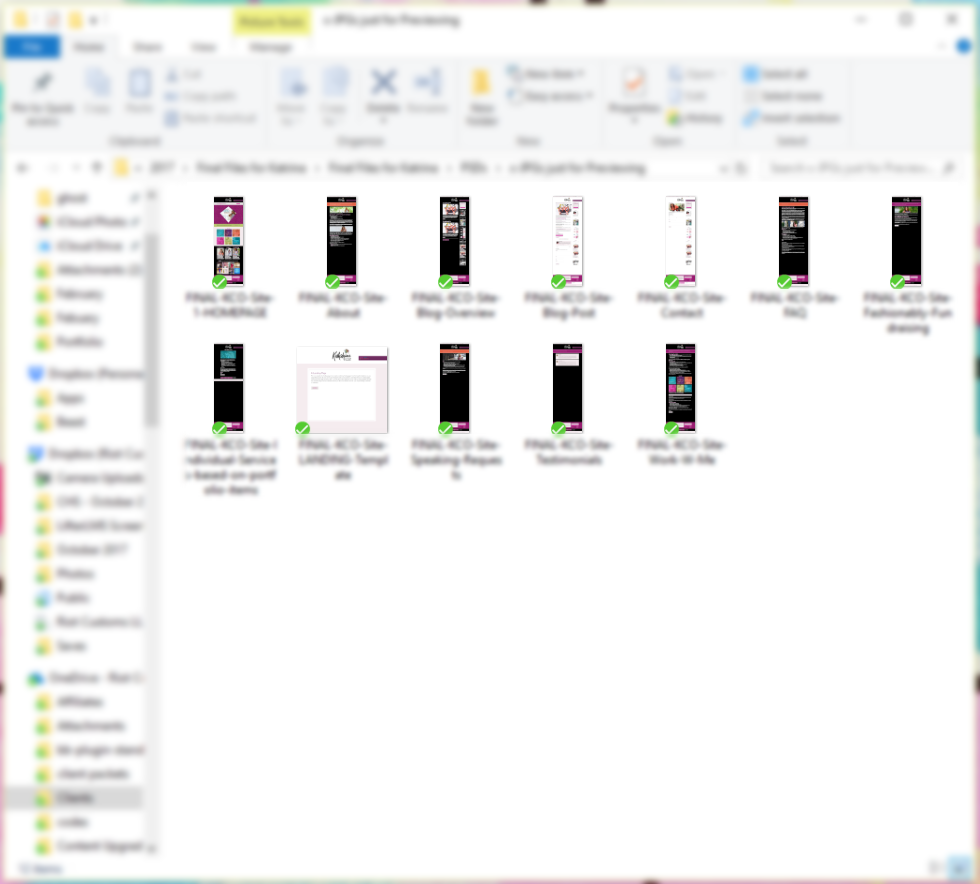
I love having screenshots because if I’m honest shit happens. Sometimes on either side, we can mess up the PSD file and accidentally save a change. This is why having a screenshot of each page can be helpful. It ensures that we are seeing the same thing when it comes to the design of the site.
Tech Translations:
DPI is used to measure the resolution of an image both on screen and in print. As the name suggests, the DPI measures how many dots fit into a linear inch. Therefore, the higher the DPI, the more detail can be shown in an image.
Designer to Developer Handoff Checklist
Before sending your web files over to your developer. Use this checklist to make sure that you'll end up with a happy developer.

Thanks for the tips! This is definitely something I need to implement. #blmgirl